2008
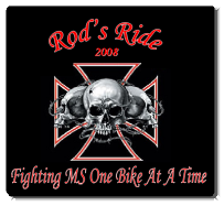
This design was chosen at the inception of the idea for the ride itself. Clearly, it was selected with bikers in mind moreso than the casual observer. It is especially close to me as the symbolism was directly related to the feelings I was going through following the diagnosis of my brother.
The (3) skulls bound in chains represent the numbers of people that are dealing with MS on a daily basis and the limitations that it can force upon them. The maltese cross set behind the skulls represents the biker support of the cause, in particular to me as it has become a theme on my own motorcycle. In short, we stand behind anyone bearing this burden, in support.
2009
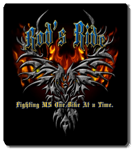
2009 began with a great amount of excitement. The cause began to evolve into more of an organized entity with the creation on the Ride2Cure non-profit entity. With more involvement from those who wanted to assist with the cause the idea of using a phoenix-type logo seemed very appropriate. The intent being that a patient with the initial diagnosis of the disease can be crippling but with proper support and the work to find a cure, our hope is that there can be "a rise from the ashes" just as the mythical phoenix.
2010
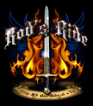
Our newest chapter of Rod's Ride has begun with strong symbolism as with previous offerings. Within the last year there have been some extraordinary breakthroughs in medicine to fight MS. It is with this battle that the 2010 logo was forged. The predominant portion of the logo is a sword which simply represents the strength and attitude that our group is moving forward with. We fully intend to arm ourselves in fighting this disease with the help of all those that proudly wear the shirts for this event.
Deeper within the logo there are some more hidden tones. The most recognizable portion being the phoenix (similar to last year) that the new logo is superimposed over indicating our continued efforts. The next item, and less conspicuous, is at the base of the sword's pommel. This portion of the symbol is more personal to the group and is a strong testament to our unwavering determination. It is an ancient Celtic knot. The knot is a representation of the relationship that the original ride patriarchs share with any and all who join the cause. In short just as the lines of Celtic knots are interwoven, so are we interwoven with all those around us. We continue on to eternity as others continue on to eternity, inexorably wrapped up with all those who join us in this life and the next. Though each loop is individual, each loop cannot be separated from the whole.
2011
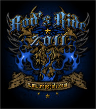
At first glance, it is clear there are several distinct similarities to all previous logos, which ties all the past events with current and future rides. The Phoenix is a keystone of our event and continues to represent the potential to rise from the ashes. The 2 phoenixes incorporate the '09 and '10 designs and will continue to be an integral part of all future logos. The lower rocker with the emblazoned website is the road map to the event's history and future. The stars located within the scrolls of the rocker pay homage to all those that have participated with us in this event, whether it be through the participation or the partners in sponsorship all are truly a gift and we wanted to include them in this logo. The single large star at the center serves as our focal point; focusing our energy of reaching our goal; to never lose sight of why the event was created: To find a cure for MS. The three stars below the rocker represent the charter members and their continuous commitment to the cause. Finally, the overall logo in general has become weathered. The ride itself has unfortunately weathered multiple downpours (which we hope not to duplicate), which is a real testament to those that have been with us on each and every ride. But more importantly: bikers by nature are in fact weathered. From the long heritage of the veterans who rode, the trailblazers before us and to the fortunate sons and daughters who are able to enjoy freedom today because of those in the past. We all carry some of that heritage/weathering with us each time we ride .
In addition to the Main event logo, we have added a sleeve logo that will become a permanent part of all future rides. The anchor logo has been used for centuries and with it has several symbolic meanings.
The anchor represents stability and security in the physical world and also hope, trust and steadfastness in the spiritual world. As the waters of life become turbulent in dealing with this disease and other issues, the anchor holds us firmly in place so others can reach us and help us when in need. The anchor also represents the stability of a family, a father or brother that is there and will serve as a foundation for you.
2012
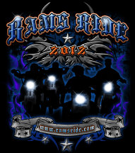
The rebirth. Moving into 2011 during a board meeting some realizations were made. As a group we were astounded with the amount of participants that had, in some way, been touched by the MS monster. Through discussion a motion was made to change the name of the event. As the event was created with a specific namesake in mind and had grown in number/popularity it was a difficult discussion. In the end we determined that it was very important to embrace the idea this fight being staged with/for all that have been touched. At the 2011 ride RAMS Ride was introduced and shared to the collective that it would be the event moving forward. Riders Against Multiple Sclerosis will join together on August 4, 2012 and continue the movement toward finding a cure and treatments for all those afflicted by this disease.
Now, on to the logo itself: 2012 will be the first time the logo showcases the spirit of the event with the illustration of the brotherhood of motorcycles. Bikers riding shoulder to shoulder in solidarity against an unseen enemy, is an unequaled fundraising force. The nameless/faceless riders rumbling with headlights of hope as a beacon cutting through the darkness that MS causes. As introduced in 2009, the Phoenix is once again a large part of the logo and will remain so in the years to come based on its mythical connotation as described previously. Again, as in years past there are many significant recurring themes: weathered appearance, stars, etc.
2013
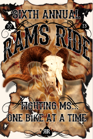
The latest offering in the ride logo has been fashioned after a wanted poster from the days of yesteryear. The poster, with its weathered and damaged exterior, is a call to action for participants. This year we are hoping to involve more participants than ever before. As the ride has grown each year, we're really looking for this sixth installment to see more bikes and participants than ever.
This new design also marks the return of the original ride tagline: Fighting MS, one bike at a time. It was important to reignite the true idea of the event and that is the assemblage of a large group of individuals coming together as one to fight against this terrible disease.
The ram skull, in some aspects an obvious choice, in this form shows the strength and longevity of our cause. We will be around fighting for and toward a cause until that need is satisfied. The skull is often times used as an object of something aged that's been around for a long time and does not fade or go away. Again, there is plenty of symbolism within the art. Every year we pride ourselves on the signature items hidden within the design. Once again the phoenix is a very prominent in the background. The phoenix remains a centerpiece in the background, following the tradition in previous logos. It is a very strong symbol and will always be a staple in our design.
Other noticeable returning items include the top dead center star represents the origin of the event and the signature as why we ride: to find a cure for MS, the year presented in spades is a small homage to the event's VP and the connection that started much of the board's relationship which was born at a poker table more than a decade ago.The back to back "R's" at the logos lower portion are two-fold, they represent brothers back to back in support of one another as well as the RAMS Ride philosophy which is steeped in brotherhood (on many levels).
The three stars on the perimeter of this newest piece are representative of the charter members and their continuous commitment to the cause.
2014
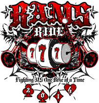
LUCKY #7! The Seventh Ride logo incorprates a Vegas Feel with the Slot Reels taking center stage. The number 7 and Luck seem to go hand and hand. We have been lucky to have the support of the volunteers, sponsors and riders so thought it appropriate to incorporate some of that feel in the 2014 logo. The tagline remians, the Phoenix watches over the logo from behind, our charter stars surround it, and the suits of the cards emcompassing the year extends the vegas feel. We also brought back the Spade (behind the slot reels) to pay homage to last years RR (RODS to RAMS ride)
Incorporating the bikes was easy - We Ride. Bikers are great supporters of the cause - Without you there would be no ride!
2015
This was a difficult year for the RAMS Ride group, outside of the norms of the philanthropy. Due to an accident, the event was almost cancelled. It was through the support and love of the motorcycling community and our sponsors that the event carried forward.
The logo for the year, following the lucky number 7, was a more simple design. It's purpose to represent strength. As the riveted iron cross has been used to signify bravery and strength from the time of the crusades through the present, it is a fitting pictorial of our motto; "Fighting MS". The phoenix placement, as in many previous years, will always be present in showing our feelings to those afflicted by the disease. It is our purpose to take to the streets and help them rise from the ashes of the physical and mental challenges of Multiple Sclerosis. Deep within the background is a shadow of the phoenix, this particular image representing an individual effort and the reason that the event was created.
2016
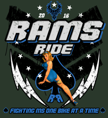
The 9th annual ride was a great deal of fun to assemble. The idea of modeling the logo after a pin-up from yesteryear pays homage to veterans across the United States. As a motorcycling benefit, there are many ties to the military. It only seemed fitting that we acknowledge and honor that commitment. In addition to the central pin-up, the complete image is superimposed over a military leadership rank. Leading a uniformed outfit throughout the streets, in a true regimented (safe) grouping, this seemed appropriate.
Deeper within the logo there is other symbolism, there are 9 stars encircling as this is the 9th event. Also, the back to back R's return as the brothers stand shoulder to shoulder against MS. Atop the logo rests the familiar phoenix, the unofficial trademark of the event.
2017
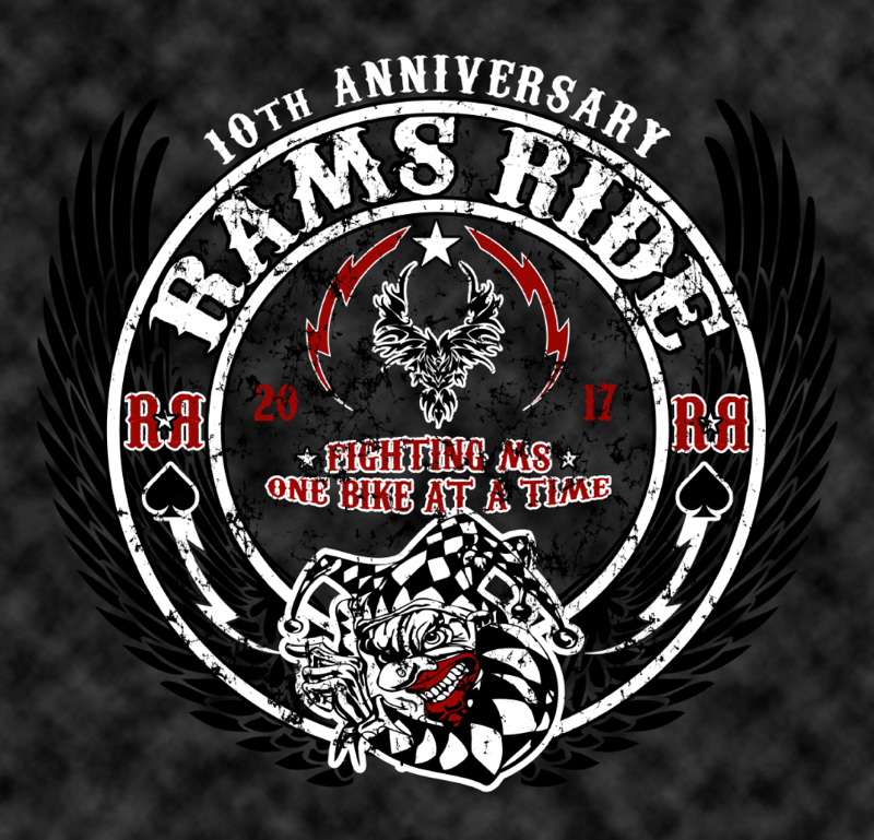
10th Anniversary logo! Happy birthday RAMS Ride. Since 2008, a grassroots effort has grown to become a very successful event with one purpose – finding a cure to Multiple Sclerosis. Since the inception of Rod’s Ride, which in 2012 became RAMS Ride, all proceeds from the event have been given to the National Multiple Sclerosis Foundation. The platform of this year’s logo was based around our celebration, and our appreciation for all that have joined our fight against MS. The sinister jester is a classic, twisted biker staple. He laughs in the face of danger and walks toward the scuffle, not away. This is our approach to fighting the disease, head on and unrelenting. The phoenix, a signature that started in 2009, is ever present showing rise from the ashes outlook following an MS diagnosis. After learning such news it is our RAMS that assist all in rising, to remain positive and strong in the face of horrific news. Back to back R’s make their way into the fold again, as they represent two brothers side by side determined to hold one another up regardless of what tribulations there are to face. For those of you that have been with us before, welcome back. If you’re new to the effort, welcome to a passionate and determined family.
2018
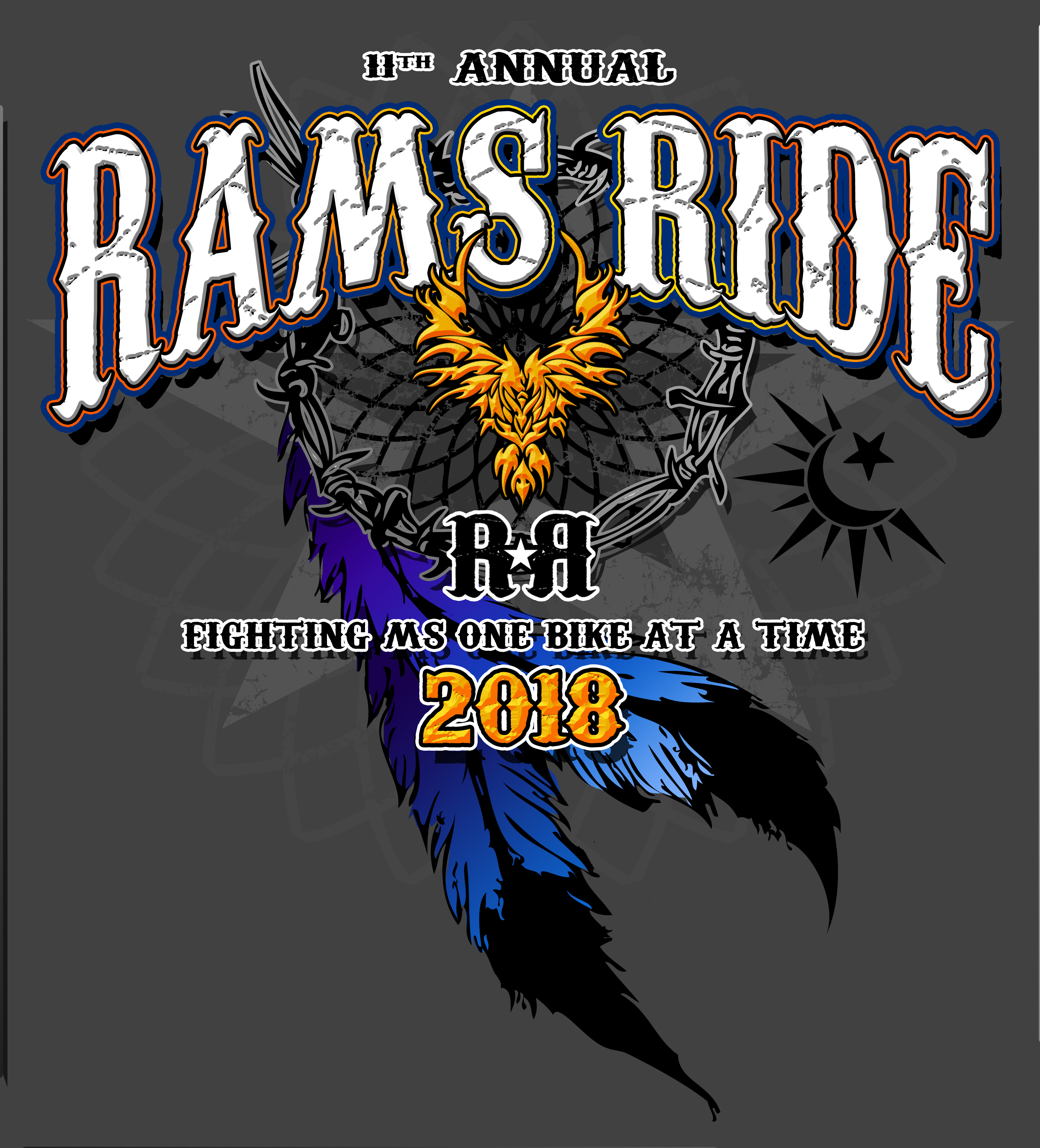
This year’s logo is built in layers, similar to those of the past. There are symbols from previous shirts and the introduction of new as well. This year represents a departure from the typical theme. Traditionally our logos have been based on the fight and subsequent defeat of Multiple Sclerosis. 2018 offers a different take on the cause and our goal of a cure, hopefully in the near future. There's one large star for the cause and it's below/under a dream catcher. The dream catcher is our spiritual representation that the worlds will come together in science, technology and faith in the hope of a cure. The feathers represent the effort, as it started with the vision of two brothers. The barbed wire band is the tribulation caused by life with the disease. The sun and moon symbolism adds the idea that we want those afflicted to carry forward. The circular shape alone is a symbol of the never ending circle of life. Placing a half moon and half sun inside the circle supplies even more meaning. The sun, especially coupled with our annual phoenix, is often recognized as a symbol of rebirth, strength and power. The moon illustrating mood and inner emotion, is something this event strives to signal to those affected with MS. It is our passion for all to understand that we are alongside them and working tirelessly to ease their burden. We look for 2018 to be a banner year for this event!
2019
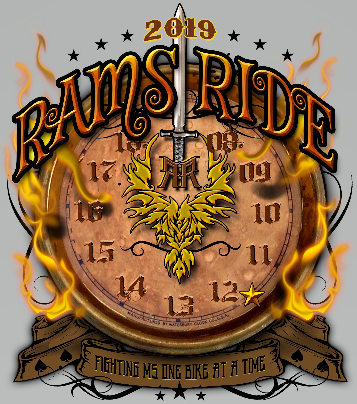
At first glance a clock is noticed, upon a deeper glance, each year of the ride is illustrated. As our 12th year, it seemed only fitting to incorporate a timepiece. Time is the enemy of a great many things in our world, most notably our own bodies. Each morning, for some of us, it can be a struggle to get the day started … popping and cracking, as old joints do. In professional sports, time is looked on as the only opponent that remains perpertually unbeaten – even the greatest cannot outrun father time! It is for this that the clock shows patina and various other signs of struggle. Also, within the logo itself are several of the symbols from the previous rides. I challenge all that gaze upon it to successfully find each… Conversely, time is a very valuable weapon in the struggle against Multiple Sclerosis. The idea that through events, like RAMS Ride, we gain ground on curing and hopefully eradicating this disease. Time is working with us toward a common goal. It’s up to ALL of us to carry the load for those that struggle during battle for victory.
2020
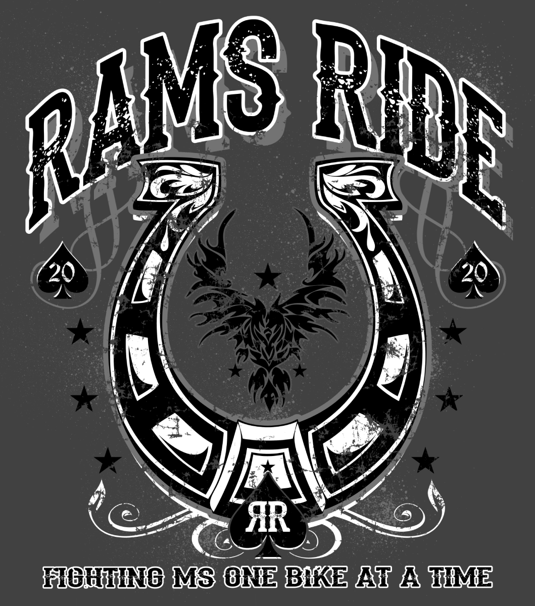
This year’s logo very quickly reminds us that this is our Lucky Thirteenth year! We are extremely grateful for all the support and success we have shared with such a strong following. Front and center is the horseshoe, for multiple reasons. The first, easily enough, representing luck! More importantly, however, is the symbolism of the actual horseshoe. For it is the tool that a majestic animal cannot perform without. The horseshoe is what allows the foundation success. The RAMS Ride family, which includes all supporters, is setup for fighting alongside those afflicted with Multiple Sclerosis as a basis for a strong foundation for THEIR success. There are some more familiar symbols duplicated from year’s past. Noting the back to back R’s, as brothers that never let anything get between their diligence in the cause. The phoenix, as always, centered on the logo which always illustrates the power of resurgence following an MS diagnosis. Our tagline, or motto, which will always be Fighting MS One Bike At A Time. Our riders are a testament to strength as their numbers show the solidarity of our mission. There are also stars prominently displayed for members or our founding unit and the singular one shown as the impetus for our event. We are very proud, and look forward to taking to the road this year!
2021
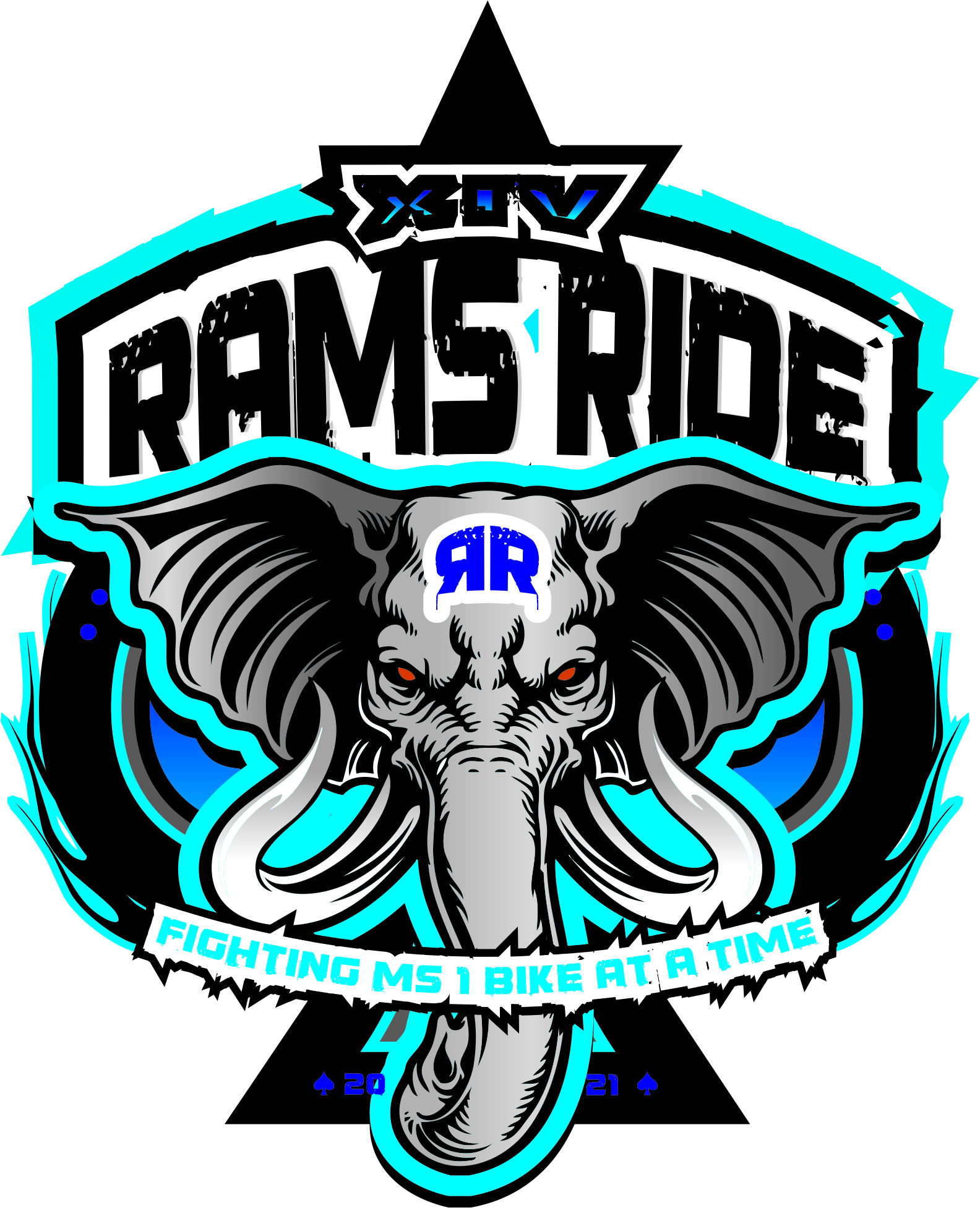
We are extremely proud to be hosting the 14th annual ride this year, following (mostly) a global pandemic! The outpouring of support and faith in our cause has always kept us steadfast in working toward the best event in the motorcycling community. This allows us to make a substantial impact in the fight against Multiple Sclerosis. This year our thought was to showcase the strength it takes to remain committed to the fight against Multiple Sclerosis. What more fitting to embody this than the elephant, a pillar of strength and honor. As a majestic and powerful creature the elephant, like our event, weathers the storms of both seasons and time without faltering. The motorcycling community is certainly close to this, as riders we are strong together and always focused. As with years previous there is strong symbolism within the logo. The ever present phoenix as the backdrop, with stars representing the founders. The back to back R’s again representing the brotherhood that started the fight… In the true spirit of solidarity against this terrible monster (MS), we hope you will stand with us!
2022
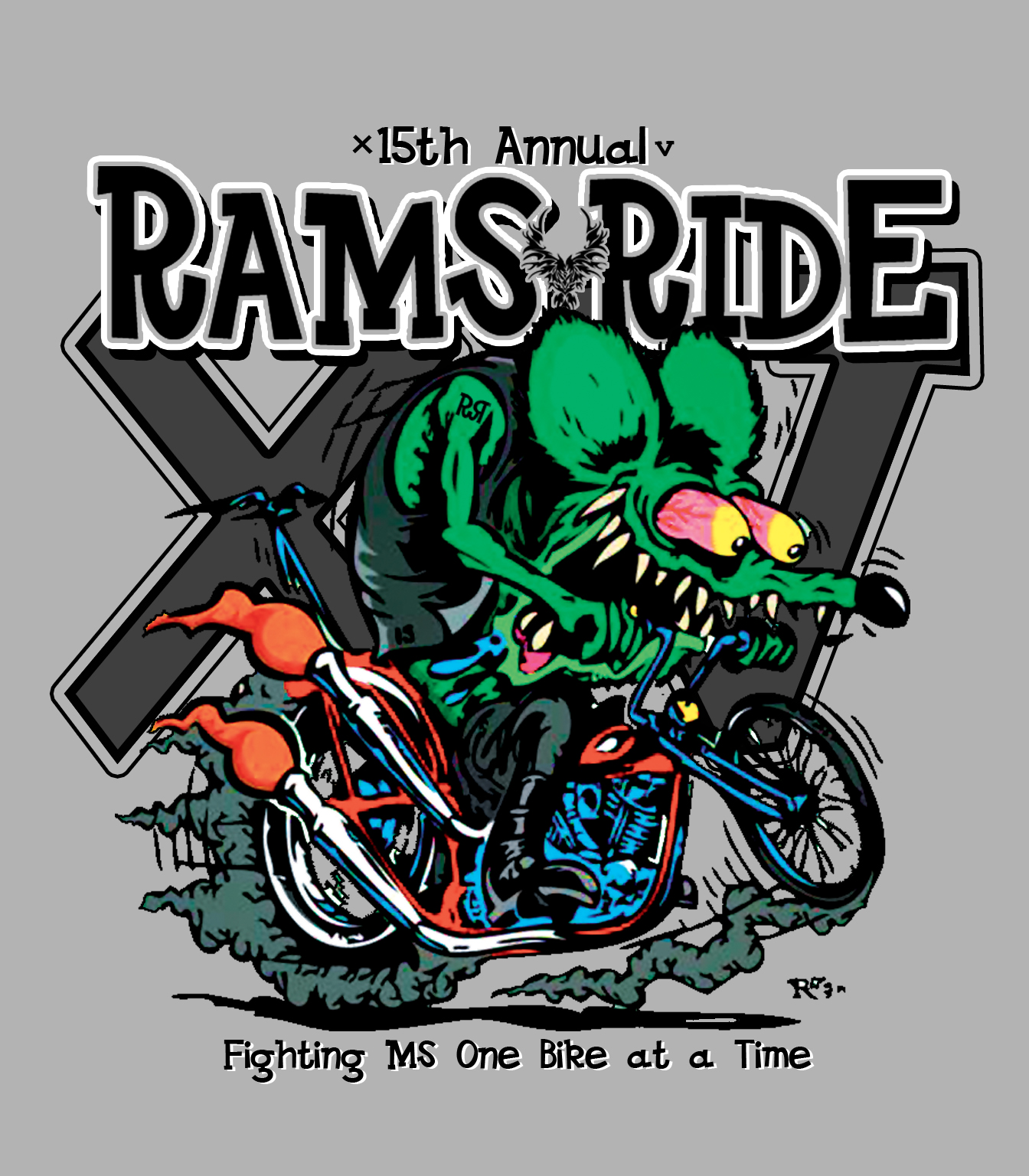
We are so incredibly excited to launch this year's logo. As the 15th anniversary, we've built an homage to the baby boomers. This logo represents an era of Americans that need to be recognized for their handwork and sacrifice during a time when our country was in turmoil (much like today). These chopper and hotrod enthusiasts built amazing machines that epitomized individual style and grace. It is this same passion that drives RAMS Ride to be a vision in the battle against Multiple Sclerosis. It is our hope that all participants, and sponsors alike, continue to appreciate the effort and style of this 15-year-old event!
2023
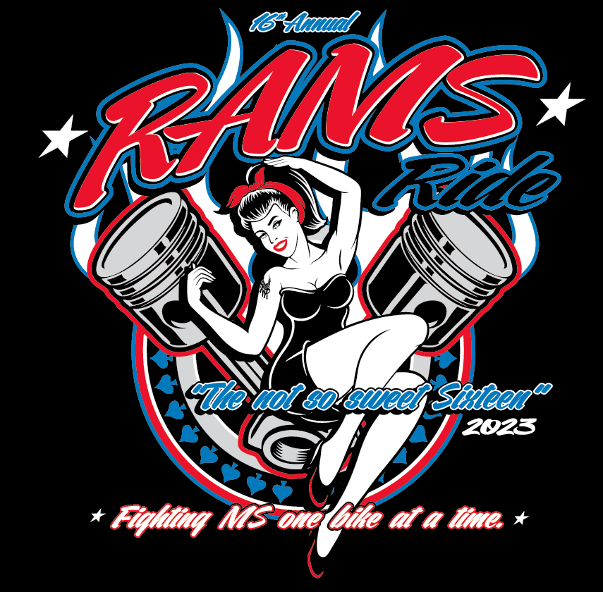
2023, The not so sweet 16th annual RAMS Ride logo is here! We are extremely excited to present this year’s logo. The country is experiencing quite a lot of unrest at present. It seems that some are forgetful of the past. That stated, we present a logo with an homage to history. This year showcasing a traditional pinup. Dating back to WWII, she is a symbol of strength and freedom expressed by soldiers in wartime. The pinup girls were the strength of our country in those folks that were left behind while troops travelled to foreign lands. Further, they represented the personalities and loved ones remaining at home, that were so desperately missed. There are several key components in this year’s logo. The ever-present phoenix, the foundation of the artwork, remains in the background. It remains the symbol or our timeless commitment in rising from the ashes of a diagnosis. The pistons in the shape of a V have multiple meanings, representing the V-twin motorcycles leading the ride and the thought of Victory against the disease. On the right shoulder of the pinup, as a tattoo, the back-to-back Rs with the phoenix are detailed. Additionally, the stars representing the board members in various spots. In our fight against Multiple Sclerosis, we have remained diligent with our goal. We ride to raise funds as ammunition in the fight against this disease. There are currently a great number of successful treatments in place for MS. These advancements increase our confidence as evidence that we are making a difference. We are grateful for all those that have been with us, and those joining us. In the fight against Multiple Sclerosis, we are Riders Against Multiple Sclerosis.